How it all began…
Many of you might be familiar with the iconic book series “Little People, BIG DREAMS”, dreamed up and written by author Maria Isabel Sánchez Vegara.
Each cover features the biography of an important historical figure, and on every cover, their adorable bobble head shines on a clean, colored background.

We own several of the titles at home, and I’d always had it in the back of my mind that I’d love to illustrate one of the books in the series.
In June of 2021, I wrote an email to my agents. The subject line read “A job I’d love”.
In it, I mentioned that I’d love to pitch my work and be part of the LPBD series, and could they help me put that together?
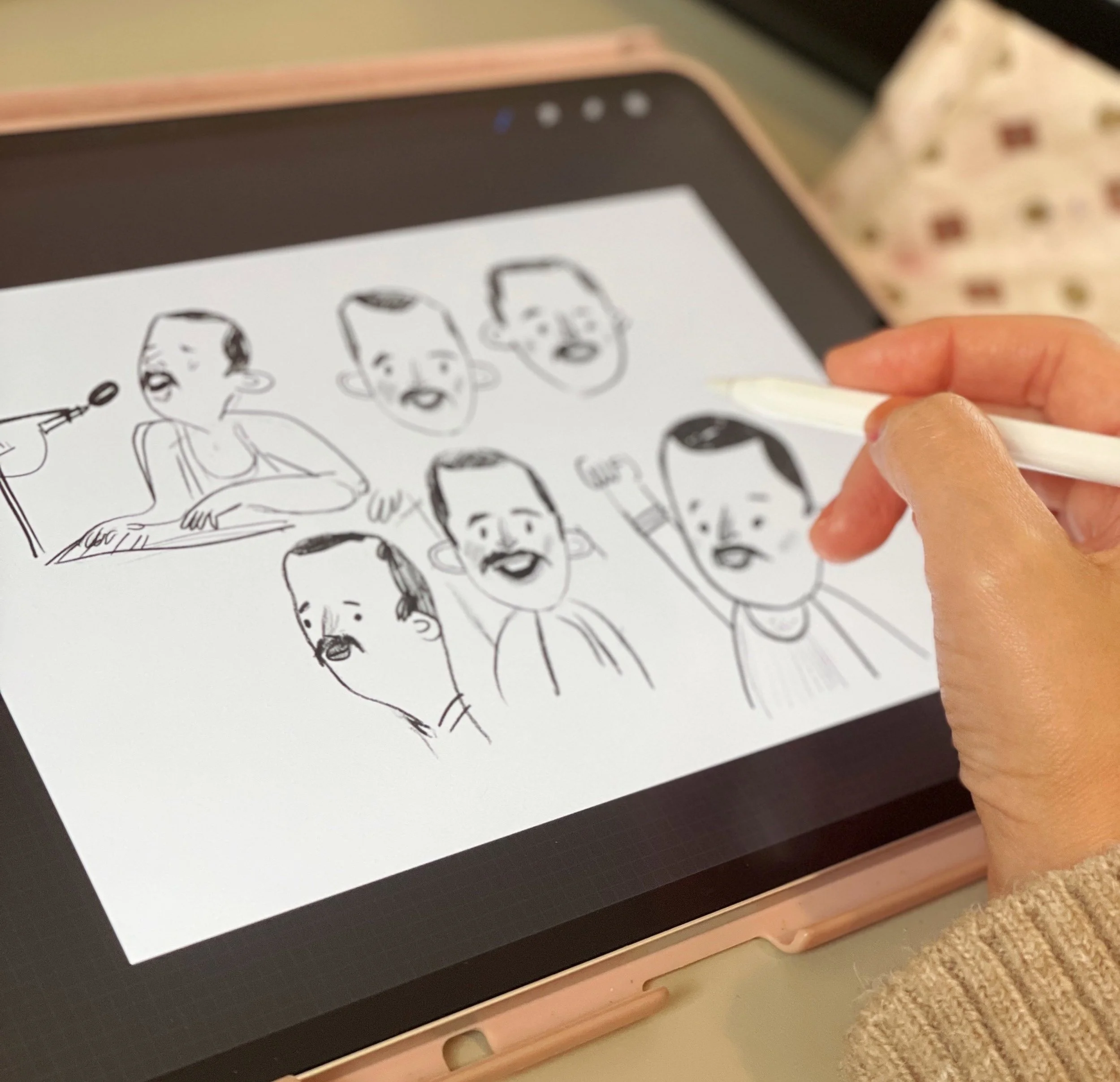
I even had a specific figure in mind, can you guess who it was? I’ll put the answer at the end! Here’s one of the initial sketches to give you a hint:
My agents encouraged me to put together a pitch, and I started working on some sketches… but this was put on the back burner as I pursued additional projects at the same time.
The historical biographies market is quite saturated, and we knew it was best not to put all the eggs in one basket.
To make a long story short, we never ended up pitching the sketches. I emphasize this because it makes the next part even cooler:
Fast forward to May 2022, a little less than a year after I reached out to my agents.
An email in my inbox from Lucy, my agent, mentioning that the team at Little People, BIG DREAMS are asking if I’d like to illustrate the biography of Louis Pasteur.
Needless to say, I gleefully accepted the job.
I’ll dive into the process of illustrating the title, breaking it down bit by bit.
The Cover…
Knowing how important the cover is to each book, but especially this book as it stands among a hundred more in the series, I asked myself an existential question: To dot eyes, or not to dot eyes?
My style currently features both dot eyes and round eyes, and each project calls for a slightly different stylistic approach.
Here are the initial sketches:

Isa (the author and creative director) and I both agreed that dot eyes felt like the better choice: they made little Louis cuter, and his face read more clearly for young audiences.
That choice also lead me to my next decision: I would illustrated this entire book in a clean, graphic style. Still very much a hand-illustrated look with texture and shading, but I’d hold back on the sketchy lines. Colors would be very much confined to their outlines, and body shapes would be drawn at clean, angular poses. This felt fitting for a biography aimed at children.

I chose to create slightly stiff, graphic poses for the characters. I also decided to illustrate most spreads from a simple straight-on, front or side view as opposed to complex bird’s eye views
Creating Louis
This book posed an interesting challenge, in which I had to portray Louis Pasteur throughout his life, from childhood to late adulthood.
Needless to say, he would look different as he aged, but I had to find a way to make him recognizable throughout, especially when depicted in a spread alongside other white, bearded men of his age.
Isa knew she wanted Louis to be in his powder blue jacket on the cover, and so we decided it was best to show him in it throughout all of the spreads.

Just some of the reference images I relied on when illustrating the book. Can you see Louis looking dapper in his blue jacket?
But I figured I could take some creative license, and give him auburn hair. And just to stretch that license a bit further, I sprinkled some freckles on his face and gave him a cute little cowlick.
I felt that would be a nice little touch to make him pop on each spread. Do you agree?

I figured no historian would come sue me if I gave Louis freckles and a cowlick- the grainy historical reference photos left enough to the imagination.
Picking a color palette
With the light blue jacket being a given, I knew I wanted Louis to pop on each spread.
I felt a slightly de-saturated and warm palette would accomplish that, plus, it worked well with the soft tones worn by people of that time, as well as the wooden furniture that would be depicted on some of the spreads.

I picked a warm color palette that would make Louis and his blue jacket pop.
Green was the hardest color for me to incorporate into this palette, and I settled on an olive-y tone that lended itself well to the ochres and browns.

I loved this desaturated olive green for the trees and bushes in this book. It was the shade I felt worked best with the ochres and muted corals. Many other greens just overpowered the spreads.
A hidden metaphor
I decided to use the weather to show where we were in the age of medicine.
The first spread depicts a funeral procession, and the text reads: “Little Louis was born in France at a time when doctors didn’t know much about why people got sick.”
The scene shows a bare street, and snow has fallen and landed all around. It was a time of uncertainty and sickness. No trees to be seen.
As the story progresses, (and though many seasons transpire over the years), the spreads carefully depict the trees in the windows gradually blooming and growing. This is just a visual reminder of how far medicine advanced, in part, thanks to the Louis’ discoveries.

I used the changing seasons as a visual cue for the advancement of medicine…
The endpapers…
This was my first time designing endpapers, can you believe it? To say I had fun with this is an understatement.
I love creating repeat patterns, and creating this pattern of microbes was no different.
I spent quite a bit of time deciding on whether they would be dark, or light… and picking what I felt to be just the right scale; too small and the detail wouldn’t show, too big and it would no longer feel microbe-like.

The endpapers, along with the cloth-bound spine just make the final product feel like such a precious treasure.
To sum is all up…
I loved working on this book, from start to finish. I wish I could illustrate a hundred more of them.

Little Louis and me.
I hope you enjoyed seeing a bit of the behind-the-scenes of putting it together. Let me know in the comments if you have any more questions about the process!
If you’d like to own your very own copy, you can pre-order it here:
***Did you guess who I originally wanted to pitch for the series?
If you guessed Freddie Mercury, you’re right!